Challenge: Redesign Qudos Bank’s outdated internet banking platform and mobile app as part of a brand refresh — in just 8 months (vs. typical 18-24 month timeline for banks).
My Role: UX Lead & Team Lead | Managed 6+ consultants across UX, visual design, and front-end development through rapid Agile delivery.
Impact: Delivered responsive internet banking platform + hybrid mobile app (iOS & Android) + reusable design system • On time, on budget • Set foundation for bank’s digital growth.
The Business Problem
Qudos Bank’s digital platforms were driving customers to competitors. Their internet banking and mobile app were slow, limited in functionality, and frustrating for members. Unlike major banks with 18-24 months and large budgets for redesigns, Qudos needed a complete digital transformation in just 8 months.
The goal: deliver a modern, competitive banking experience that would last for years — fast.
My Role & Contributions
I joined HeathWallace as UX Lead for this project and quickly took on broader team leadership:
Leadership: – Built and led the UX team (4 UX designers + myself) – Managed cross-functional design team (6+ consultants across UX, visual design, front-end) – Coordinated with Infosys (tech provider) on constraints and opportunities – Ran Agile ceremonies and kept design 1 sprint ahead of development
Strategic: – Shaped product roadmap through user research and prioritization – Established design process enabling rapid delivery without sacrificing quality – Created stakeholder engagement model that maintained alignment – Set quality standards across UX, visual design, and accessibility
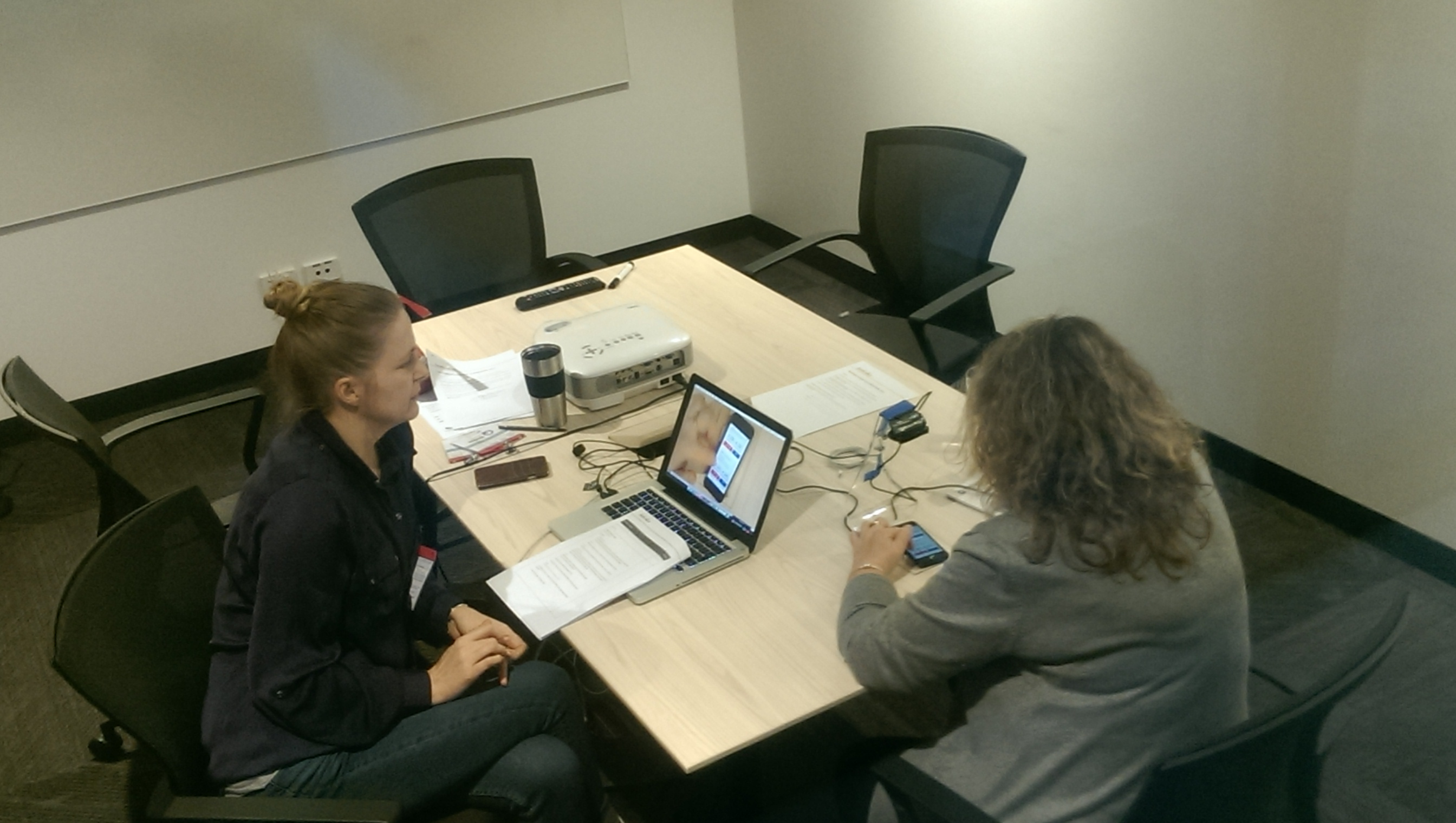
Hands-on: – Led user research (interviews, diary studies, usability testing) – Facilitated co-design sessions with stakeholders – Created journey maps, flows, and wireframes for core banking features – Built interactive Axure prototypes for testing
Key Design Decisions
Decision 1: Staggered sprints (UX → Visual → Development)
The choice: I established a 3-week sprint cycle where UX ran 1 sprint ahead of visual design, which ran 1 sprint ahead of development.
Why it mattered: With only 8 months, we couldn’t afford typical back-and-forth. We needed continuous flow.
The trade-off: Less flexibility to iterate based on development constraints, but we maintained velocity.
Outcome: We never missed a sprint commitment across 10+ sprints. The design wall and daily standups kept everyone aligned despite working on different features.
Decision 2: Build a design system first, features second
The choice: I advocated for spending the first 4 weeks building a design system before tackling full features.
Why it mattered: Stakeholders wanted to see “the app” immediately. I convinced them that investing in foundations would accelerate us later (and it did).
The trade-off: Slower visible progress in month 1, exponentially faster delivery in months 4-8.
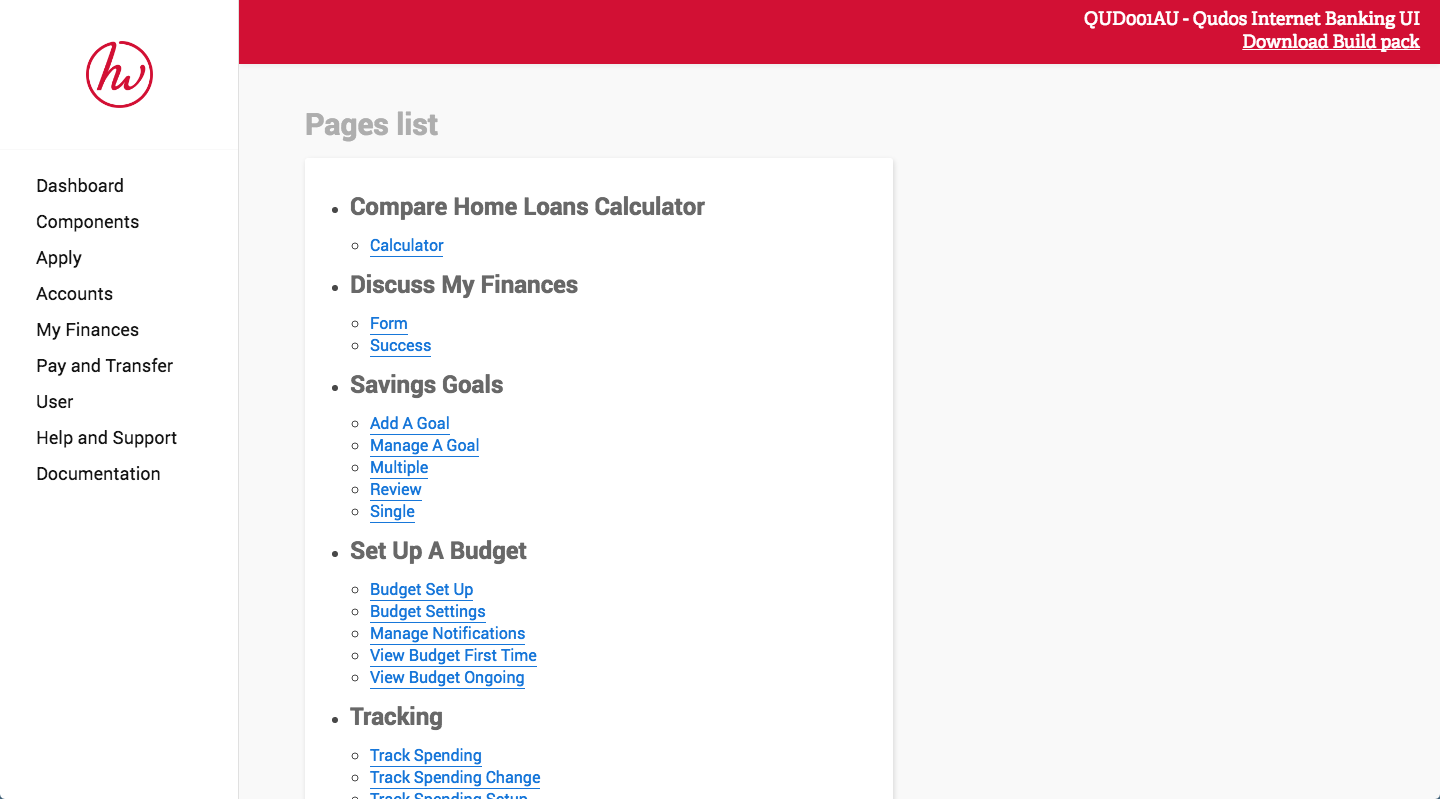
Outcome: The design system became one of our key deliverables, enabling consistency across platforms and giving Qudos a reusable asset. We documented everything in Confluence as a living digital style guide.
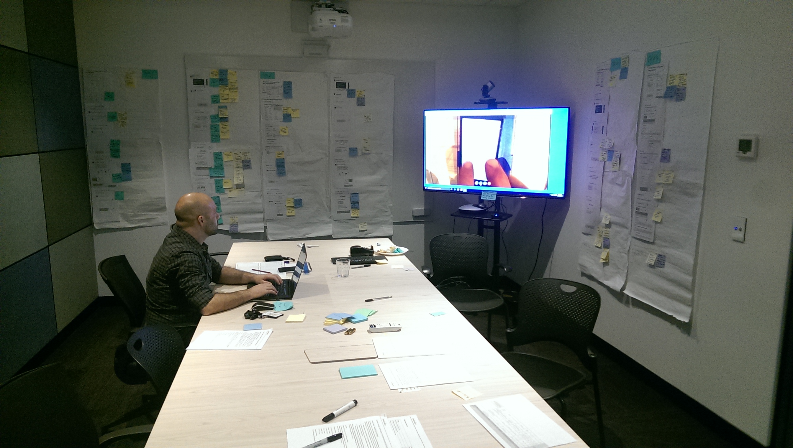
Decision 3: “Design wall” as the single source of truth

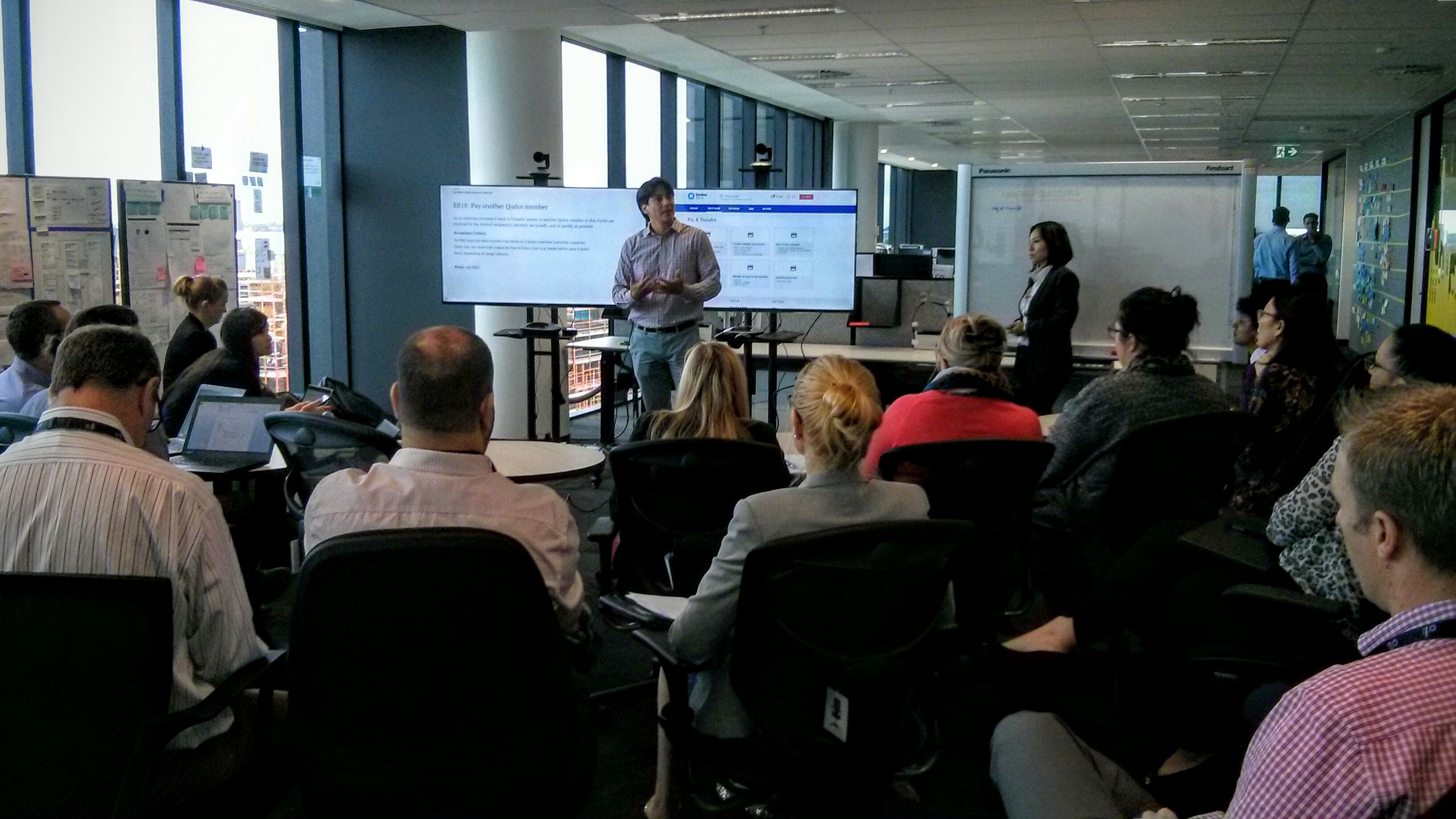
The choice: I created a physical design wall in Qudos’s office showing the entire user journey, current work, and upcoming features.
Why it mattered: With multiple teams working simultaneously, we needed radical transparency to avoid misalignment.
The trade-off: Required weekly updates, but worth every minute.
Outcome: The wall became the focal point for alignment. Stakeholders knew exactly where we were. Sprint showcases referenced it. New team members were onboarded with it.
Approach
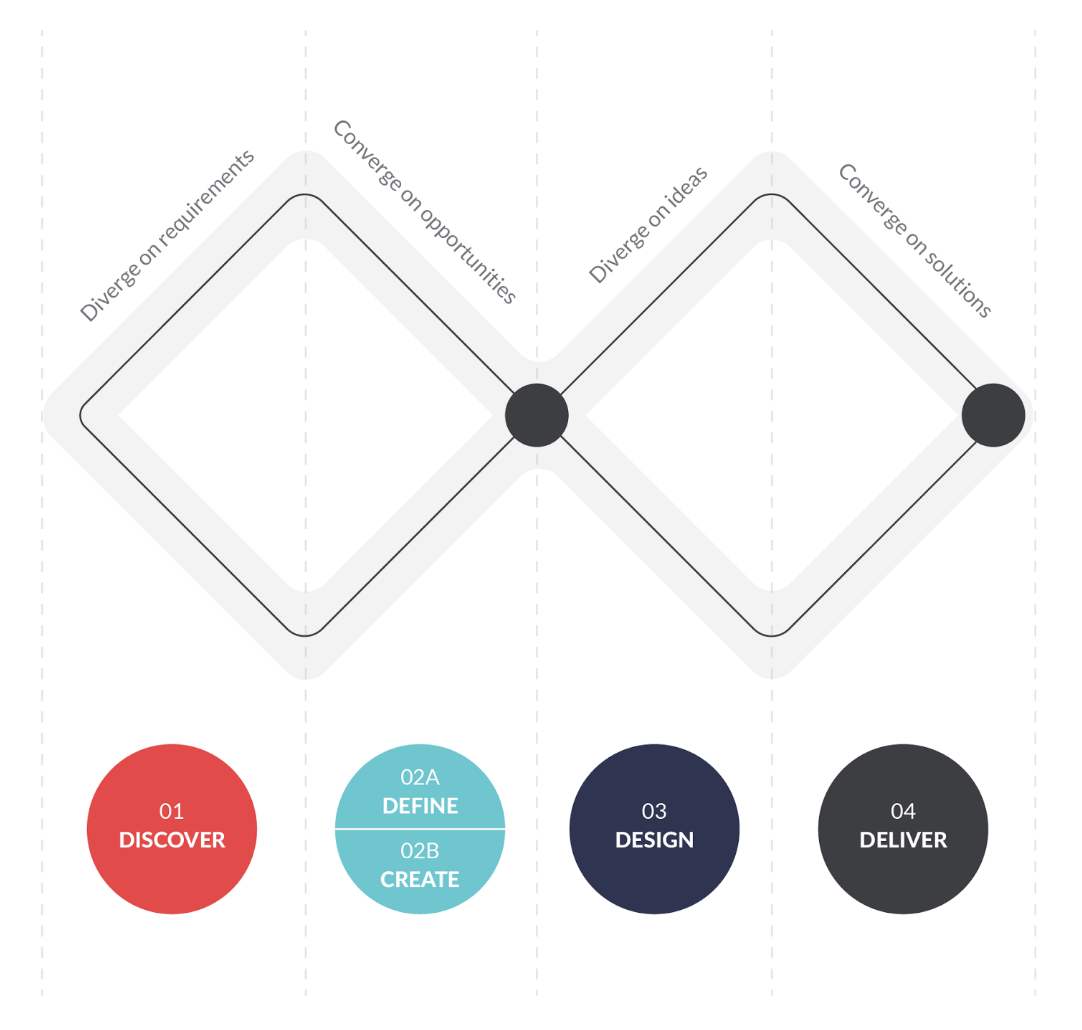
Discovery
Led the team through competitor analysis of 8+ financial institutions, technical deep-dive with Infosys, and user research with 12 Qudos members. Created provisional personas and journey maps highlighting pain points across the current experience.
Define & Create
Facilitated prioritization workshops using a value/effort framework. Organized features into 3-week sprints: – Sprints 1-2: Account overview, transactions, transfers (core banking) – Sprints 3-4: Bill pay, beneficiary management, security – Sprints 5-6: Loan applications, calculators, statements – Sprints 7-8: Profile, notifications, responsive polish
Simultaneously built the design system foundation (colours, typography, spacing, core components).

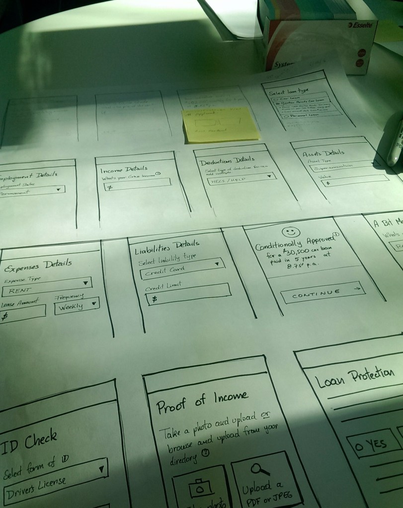
Design & Test
Sprint cadence: – Week 1: Sketching and user flows – Week 2: Wireframes and interactive prototypes – Week 3: User testing and iteration
Tested with 5-8 members every sprint through our research partner. Set up observation rooms so stakeholders could watch live sessions and participate in real-time synthesis.
What made this work: – Design wall made trade-offs visible and defendable – Strong partnership with Product Owner to manage scope – Daily 15-min team standups to surface blockers early – Weekly design walkthroughs kept leadership aligned
Deliver
Front-end developers worked 1 sprint behind design. I reviewed builds for quality, answered developer questions, and managed design changes during development.
Results
Delivered On Time
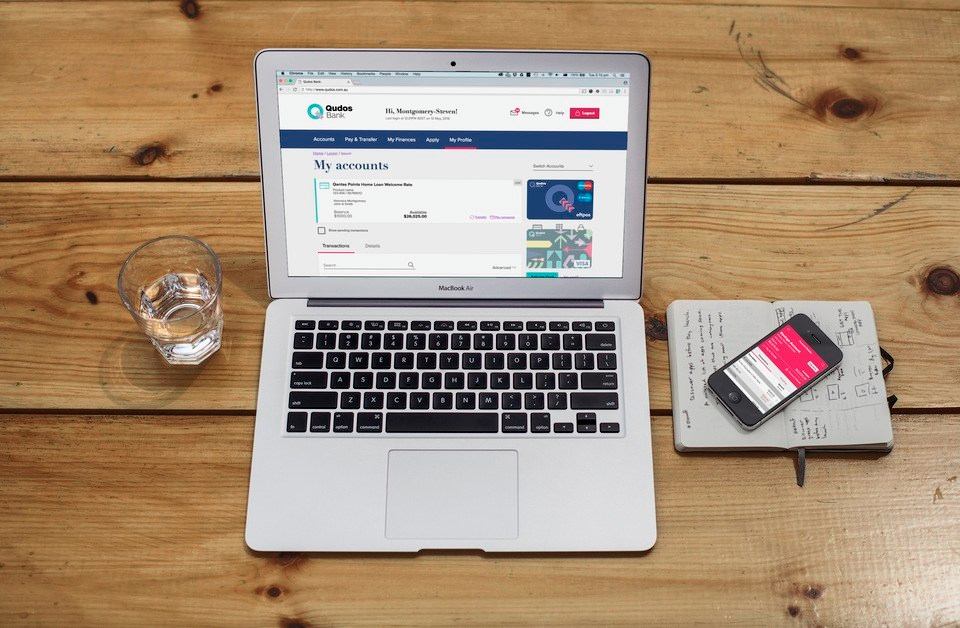
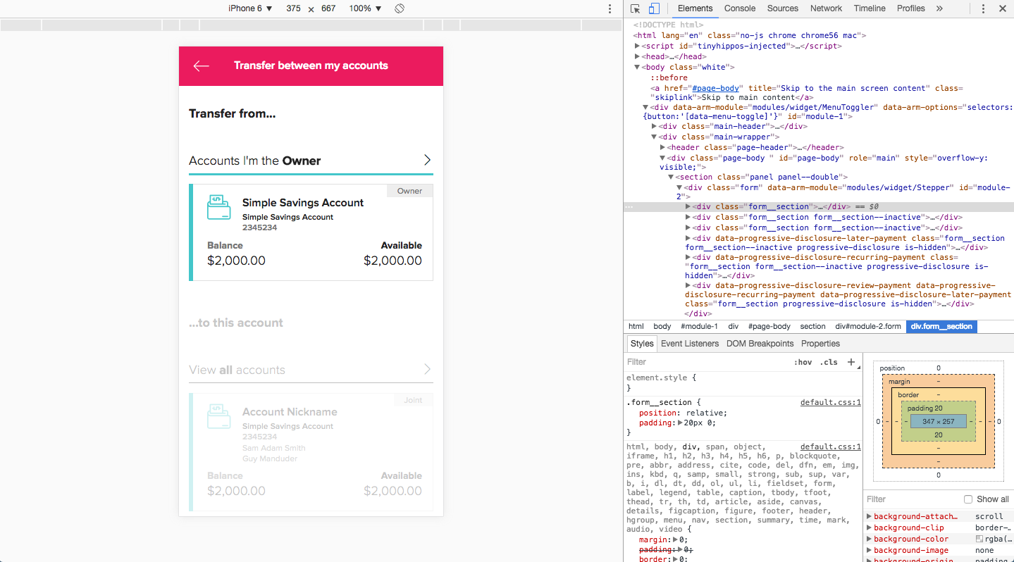
- Responsive internet banking platform with full feature set
- Hybrid mobile apps for iOS and Android with native integrations
- Design system documented in Confluence with digital style guide
- Training materials for Qudos team
User Experience Improvements
- Faster task completion: Key tasks reduced from 8-12 clicks to 3-5
- Mobile-first: 80% of designs optimized for mobile
- Accessibility: WCAG 2.0 AA compliance across all features
- Consistency: Single design language across platforms
What I’m Proud Of
Building and leading a high-performing team under extreme time pressure while never missing a sprint commitment. The design system we created became Qudos’ foundation for years of future work.

What I Learned
What worked: – Design wall as alignment tool, best decision for stakeholder management – Staggered sprints, enabled continuous flow – Design system first, paid dividends in velocity later.
What I’d do differently: – More guerrilla research for faster feedback between formal sessions – Earlier developer involvement to surface technical constraints sooner – More time for formal design-to-dev handoff documentation.
Skills strengthened: – Team leadership under high pressure and tight timelines – Stakeholder management with competing priorities – Design systems thinking from conception to governance – Rapid prioritization and scope creep.
Sample Artefacts
Research & Strategy

UX Design


Design System
Visual Design

Timeline: 8 months (2016) | Team: 6+ consultants (UX, Visual Design, Front-end Development) | Client: Qudos Bank + Infosys
