Challenge: Validate and refine Maxxia’s new salary packaging card app before launch to ensure seamless transition for 100K+ cardholders moving from a dual-card to single-card system.
My Role: UX Principal Consultant | Led stakeholder workshops, co-design sessions, user testing, and mentored client team on HCD methodology.
Impact: Identified 5 major usability issues pre-launch • All 15 tactical recommendations implemented • Prevented costly support spikes • Strategic roadmap guided 18 months of product evolution
The Problem
Maxxia, Australia’s leading salary packaging provider, was making a major operational change: transitioning from two separate ANZ cards (Salary Packaging and Meal Entertainment) to a single joint card solution.
This wasn’t just a technology change — it was a significant shift affecting how 100,000+ customers managed their salary packaging benefits daily.
The risks: – Customer confusion (users accustomed to separate cards) – Migration friction and potential abandonment – Support spike overwhelming customer service – Revenue impact if the transition failed
Why they engaged us: Maxxia lacked internal UX expertise to validate assumptions with real users. They needed to identify and fix issues before launch — when fixing is cheap, not after when it’s expensive.
My Role & Contributions
I co-led this 6-week engagement, focusing on:
Client-facing leadership: – Facilitated stakeholder workshop to align on goals and scope – Led co-design workshop to collaboratively map user journeys – Designed and moderated user testing (8 participants) – Managed client relationship and project communication
Research & synthesis: – Conducted real-time synthesis with stakeholders during observation – Separated findings into “fix now” vs. “roadmap for later” – Delivered final recommendations with implementation guidance
Knowledge transfer: – Mentored Maxxia team on HCD methodology through active participation – Modeled best practices in workshops, research, and synthesis – Involved stakeholders as co-creators (not just observers)
This was a mentorship-focused engagement. Maxxia wanted to learn HCD methodology, not just receive deliverables.
Key Design Decisions
Decision 1: Test with paper prototypes first
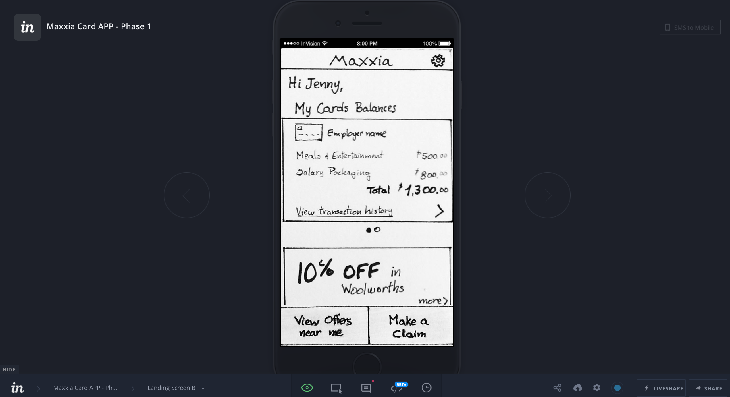
The choice: I recommended starting with low-fidelity paper prototypes rather than jumping to polished designs.
Why it mattered: Maxxia wanted to see “the app” immediately. I convinced them that rough concepts would give faster, better feedback.
The trade-off: Initial stakeholder skepticism, but this disappeared after the first user session.
Outcome: We identified 5 major usability issues in the first round that would have been expensive to fix with high-fidelity designs. Stakeholders became advocates for low-fi testing.
Decision 2: Separate “fix now” vs. “roadmap for later”
The choice: Rather than a single findings list, I separated recommendations into: – Tactical: Critical issues to fix before launch (15 items) – Strategic: Enhancements for future iterations (8 items)
Why it mattered: Maxxia had a fixed launch date. Clear prioritization helped them make informed trade-offs.
The trade-off: Some stakeholders wanted everything fixed immediately; I had to defend what was truly critical.
Outcome: All 15 tactical recommendations were implemented before launch. The strategic roadmap guided their product team for 18 months.
Decision 3: Live observation + real-time synthesis
The choice: I set up an observation room where Maxxia stakeholders watched user sessions live, then did immediate synthesis after each session.
Why it mattered: Seeing users struggle has 10x the impact of reading about it. Real-time synthesis prevents disputes later.
The trade-off: More time-intensive during testing days, but worth it.
Outcome: Stakeholders became UX advocates internally. When presenting findings to executives, they could speak from direct observation, not just consultant recommendations.
Approach
Discover & Define (Weeks 1-2)

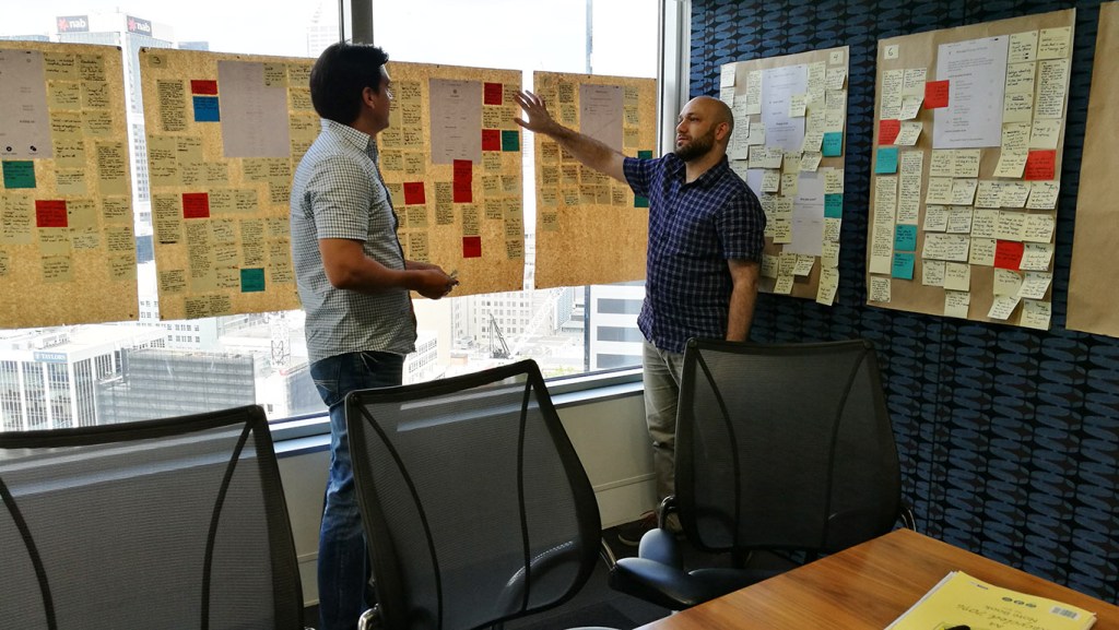
Stakeholder workshop: Facilitated a half-day workshop with product, tech, marketing, and customer service to understand business objectives, map customer segments, identify technical constraints, and prioritize features for testing.
Key insight: Maxxia assumed all users would adapt easily to a single card. Through conversation, we uncovered that some users had built strict mental models around “green card for groceries, blue card for restaurants” and would struggle with the change.
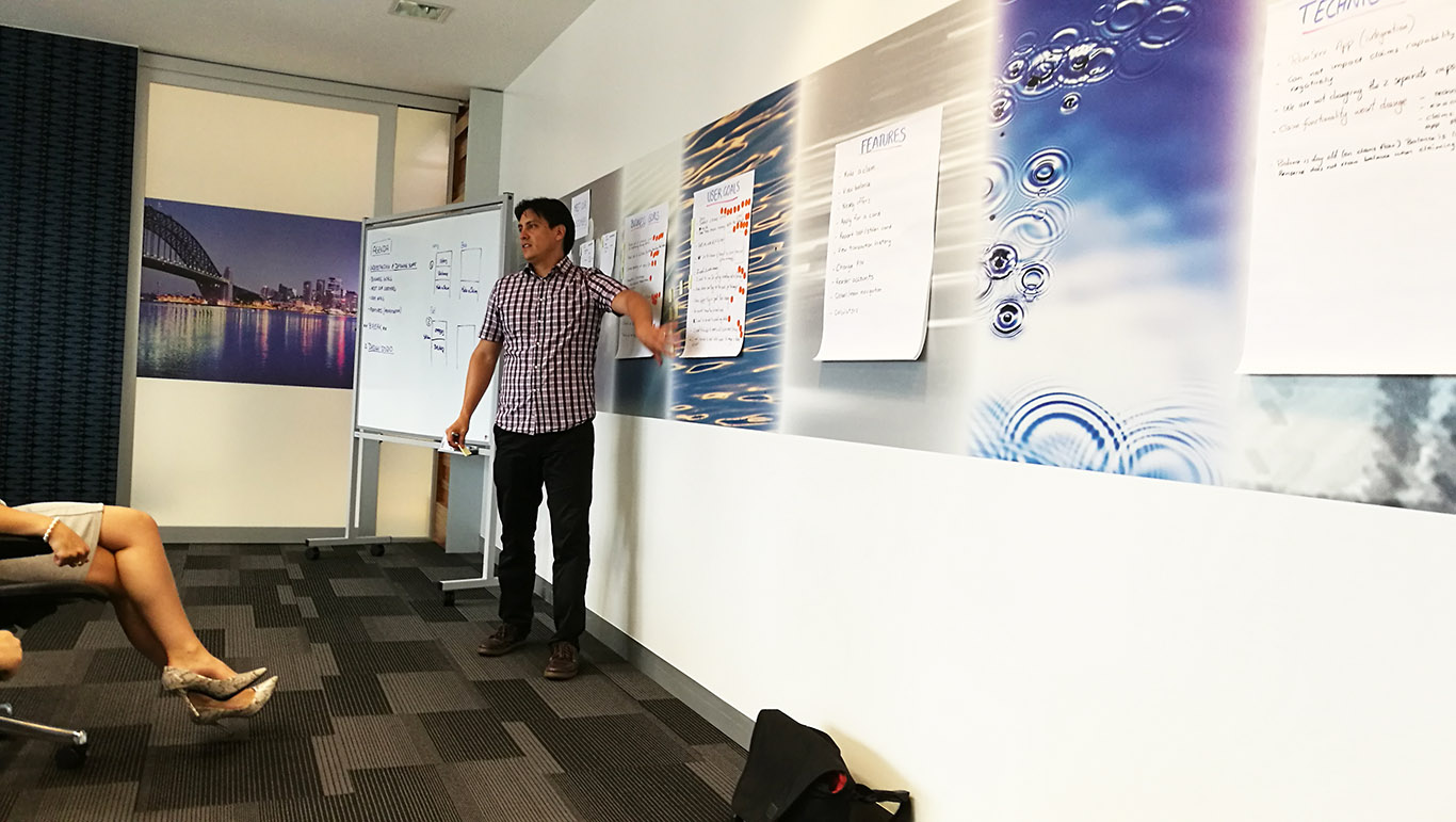
Co-design workshop: Led stakeholders through a design jam to map user journeys for key tasks, sketch interface ideas collaboratively, and align on what to prototype.
What made this effective: Stakeholders co-created solutions (not us designing in isolation), which meant better ideas and stronger buy-in.
Develop (Weeks 3-4)
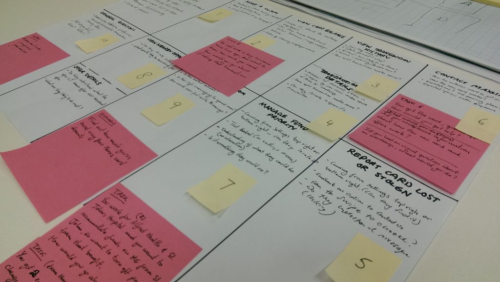
Prototype & recruit: While my colleague built the interactive InVision prototype, I wrote the testing protocol, recruited 8 participants representing Maxxia’s target users (mix of high/low frequency users, diverse tech comfort levels), and designed the research approach.
Test & Iterate (Week 5)

User testing: I moderated 8 sessions over 2 days, testing onboarding flow, transaction categorization, balance checking, statement access, and card controls.
Critical findings: 1. Users didn’t understand the single-card concept initially 2. Transaction categorization was confusing 3. Visual hierarchy issues — important info was buried 4. Missing expected features (search, spending trends) 5. Language problems — internal jargon confused users
Real-time synthesis: After each session, I led 15-minute discussions with Maxxia stakeholders to capture observations, identify patterns, and validate/invalidate hypotheses.
Deliver (Week 6)
Recommendations delivered:
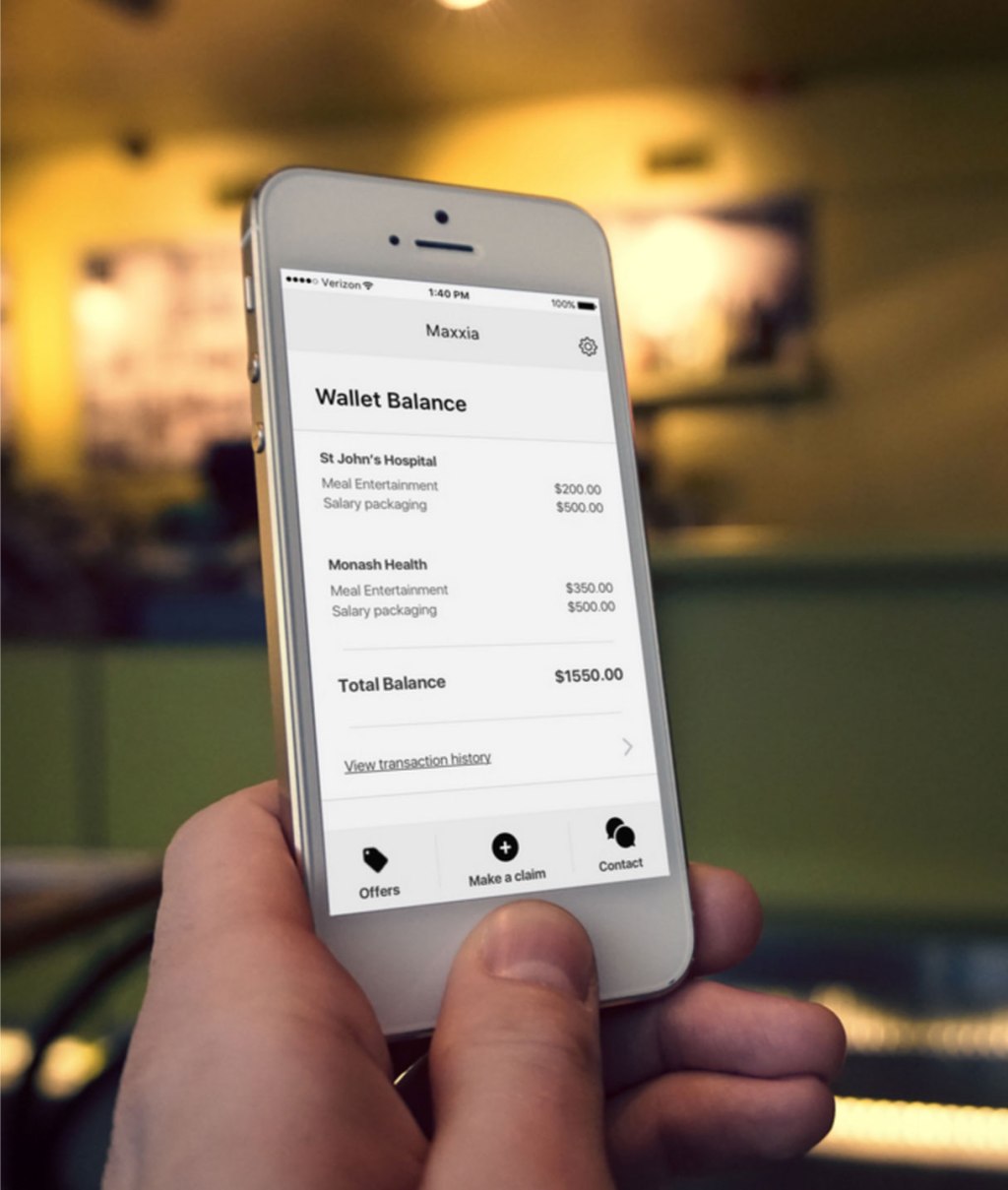
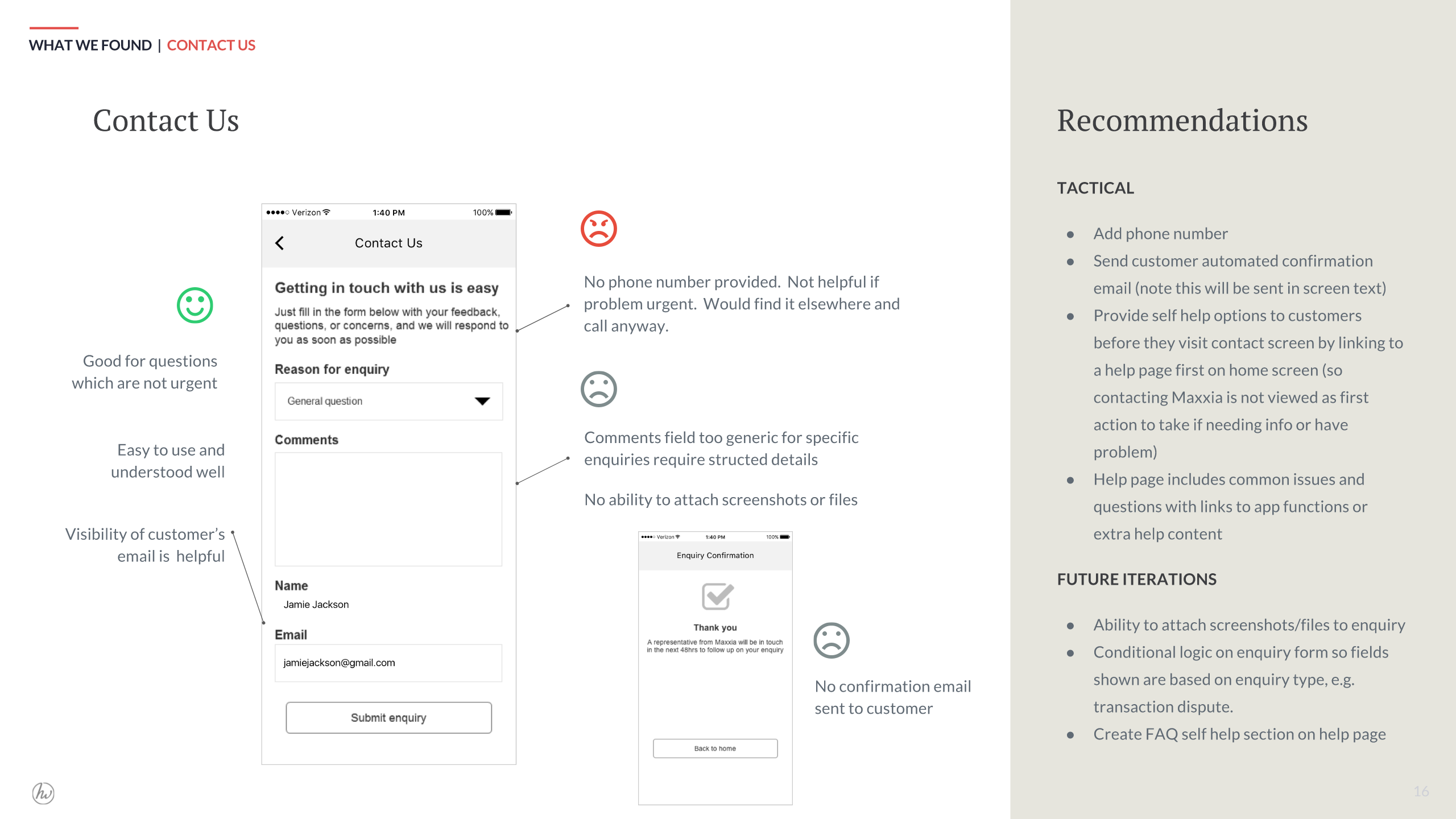
Tactical (fix before launch): – Redesign onboarding to explain single-card model clearly – Add visual indicators for transaction categories – Elevate available balance in visual hierarchy – Simplify categorization language – Add confirmation states for key actions – Improve error messaging
Strategic (roadmap): – Add transaction search and filtering – Include spending trends and insights – Build budget alerts and notifications – Create FAQ/help section within app
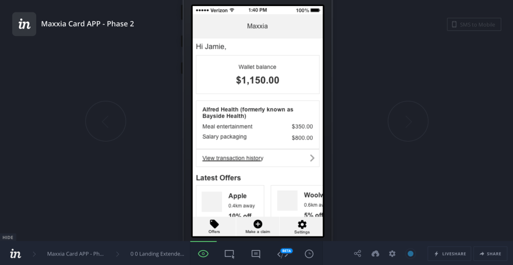
Visual design updates: My colleague created implementable designs showing revised homepage, improved categorization flow, and updated onboarding screens.
Results
Immediate Impact
- All 15 tactical recommendations implemented before app launch
- Prevented major post-launch issues by catching them in testing
- App launched mid-2017 with positive early user feedback
- Avoided costly support spikes that plagued previous launches
Client Capability Building
- Maxxia team learned HCD methodology through active participation
- Stakeholders became UX advocates internally
- Established user testing as standard practice for future updates
- Created alignment around customer needs vs. business assumptions
What I’m Proud Of
- Mentorship approach that empowered Maxxia to own UX going forward
- Clear prioritization that enabled decisive action
- Using real user struggles to change stakeholder assumptions
- Delivering comprehensive research in just 6 weeks
Sample Artefacts
Discovery & Strategy
Prototypes
Visual Design

Timeline: 6 weeks (2017) | Team: 2 UX Consultants + Maxxia stakeholders | Client: Maxxia (Australia’s leading salary packaging provider)
